Q 4. How did you use new media technologies in the construction and research, planning and evaluation stages?
Throughout the process of my media project I used a variety of new media technologies that helped me create, develop and research my ideas.
For my research I found the internet highly useful when exploring the music industry and theorists such as Goodwin and Dyer to ensure I had enough understanding on the music video industry as a whole, before planning my own project. Websites such as Wikipedia and Google enabled me the correct information and allowed me to research artists, find images of certain bands and also YouTube for official music videos of existing artists/bands.
What’s more, in the process of filming my media video I used a Samsung video camera with a tripod, this, although was successful in creating a low budget “gritty” video- a typical conventional of indie rock videos, could however have been improved if I could of used a HD camera.
The most significant was of course Google Blogger, this enabled me to plan record and develop all of my ideas, research and plans throughout my project.
IMovie on the Apple Macs was simple to use (from previous experience last year) therefore editing process was not time consuming, what’s more this year, through the help centre on the apple website I was able to discover new techniques on IMovie such as fast paced editing and using various transitions, this enabled a quirky individual music video that reflected the Indie rock genre successfully.
I also used my own SLR camera for the band photo shoot as this created professional photographs that I later edited for my ancillary texts which were a magazine advertisement and digipak.
I further developed these texts in Picasa editor a soft ware in which enabled me to edit the photographs by changing the contrast, adding effects and also different text fonts to create my final product.
For my final music video I was able to use imovie to create useful transitions such as cross blur to show passage of time, what's more I used many other transitions such as fade to black etc to create an interesting video, keeping to the conventions of a typical Indie Rock musi video. Furthermore, I used a black and white effect on the band performance shots of the video, this challenging typical conventions of a indie video, what's more creating a gritty band persona, alongside shots that link to the lyrics in a film grain effect representing authenticy and memories.
Tuesday 10 May 2011
Evaluation Question 2: How effective is the combination of your main product and ancillary texts?
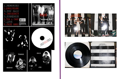
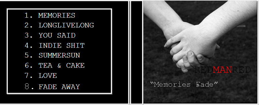
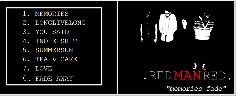
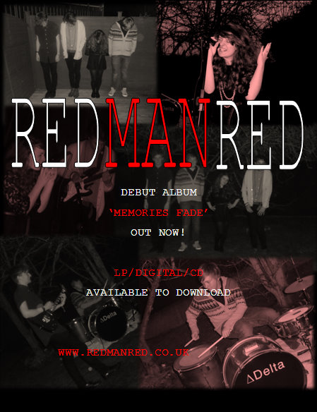
My Main product was the music video which consisted of both narrative and band performance along with my ancillary texts which were the Digipak and Magazine advertisement. Overall I receieved positive feedback from the three products that I produced, I felt that they had a link between each other therefore to present a brand image for the band.
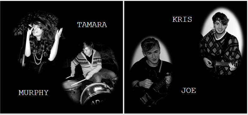
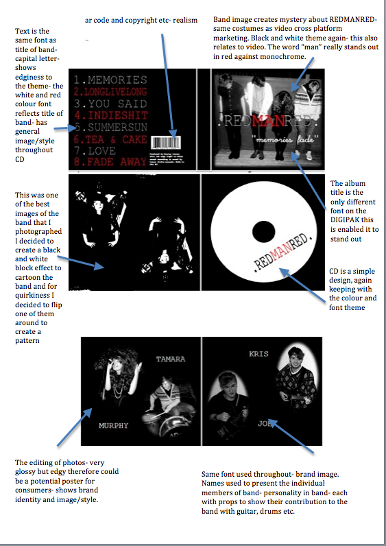
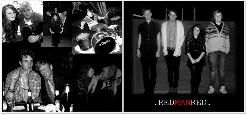
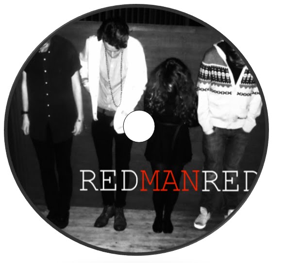
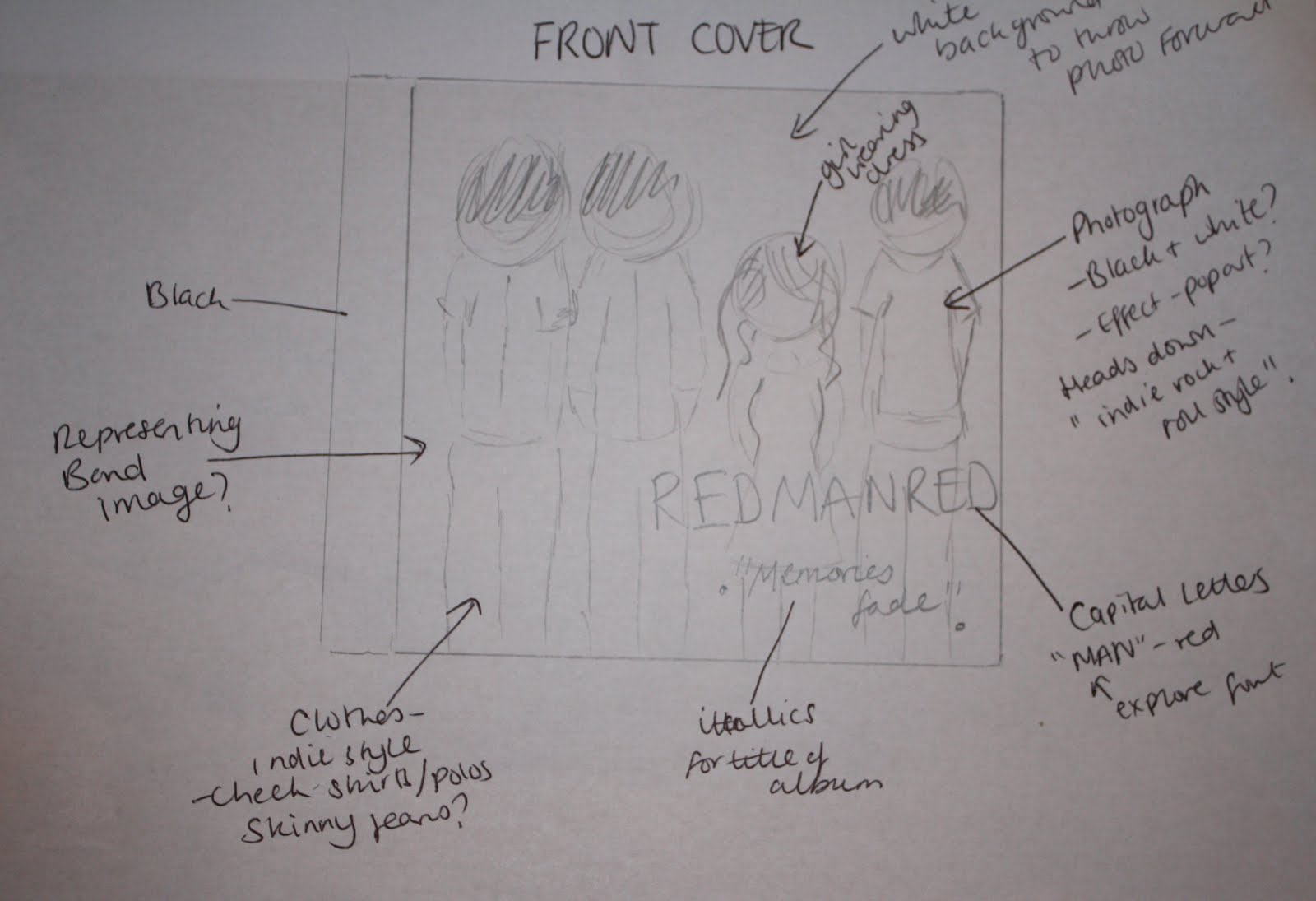
I tried to keep continiuty with the colour scheme of all 3 products, mainly in the magazine advert and digipak I kept a simple black, white and red scheme thus to create a band persona and a striking and prominent image- so it would stand out in magazines and also in cd stores such as Fopp and HMV. What's more the use of the striking colour red reflected the band title of "RedManRed" to have a band style and striking logo/title. The image of the band that appears on the magazine advertisement and digipak is the same setting in which the music video was filmed- again to try and link each one togther- the image of the band looking down and hiding their faces I thought created a brand image that is quite individual and, from reseach, hasn't been done before. However, in the insert I created a page that had a photograph of each of the band members individually to show the band personality to the audience and used their names to give a persona touch to the digipak. What's more the use of black and white is threaded throughout all 3 products, the balck and white was used for ther band performance part in my music video to enable an edgy style to the video which I think worked effectively. However, improvements I considered was the use of the band name in the music video, whether have the title at either the end or beginning or perhaps on the drum kit, again to promote their name and the band themselves.
In my research I found that Blondie used the same colour theme as my chosen digipak, what's more in her video "hanging on the telephone" it is set in the same background styles as her album "Parallel lines"- this very effective and linked effectively toegther.
What's more the target audience of 16-25 year old (males and females) had to be considered in the creation and construction of my products, therefore certain elements of my products had to show this particular style. For example the continiuity and style of the costumes you would most likely see in stores such as Topshop/Topman or H&M - these stores in which my target audience would most liekly shop in- therefore cross marketing products.
Overall, the combination of all three products, from feedback, worked quite effectively, the use of the continuity helped with the overall style of the band. The style of the band I also tried to show through different elements such as effects (black and white), style and costume, settings and photography, this overall created a edgy indie rock style through all three products.
Sunday 3 April 2011
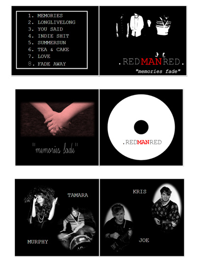
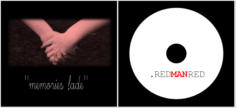
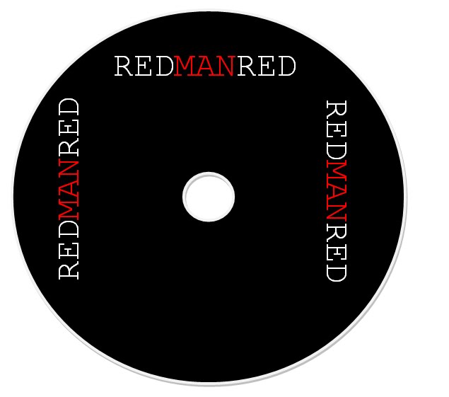
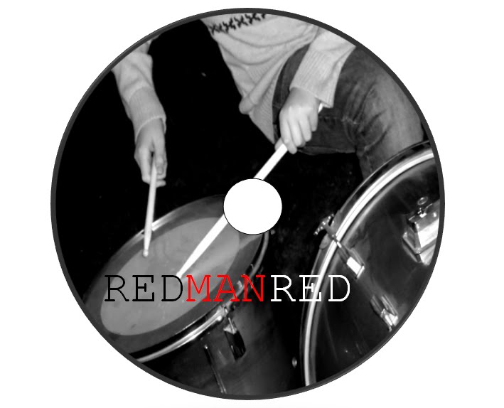
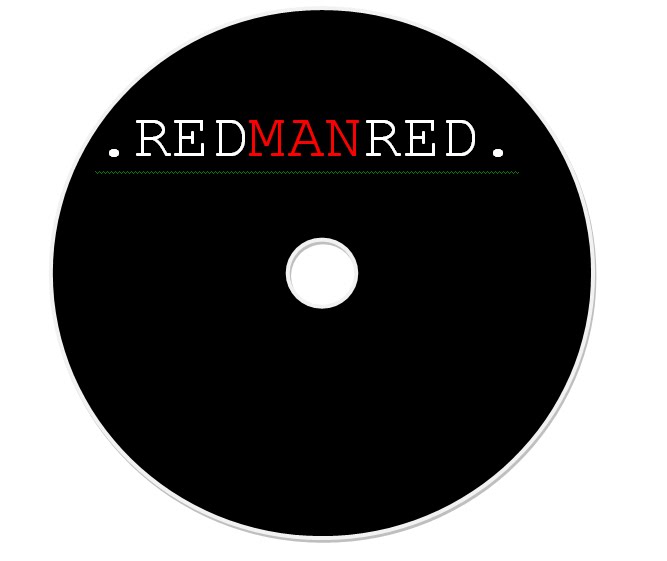
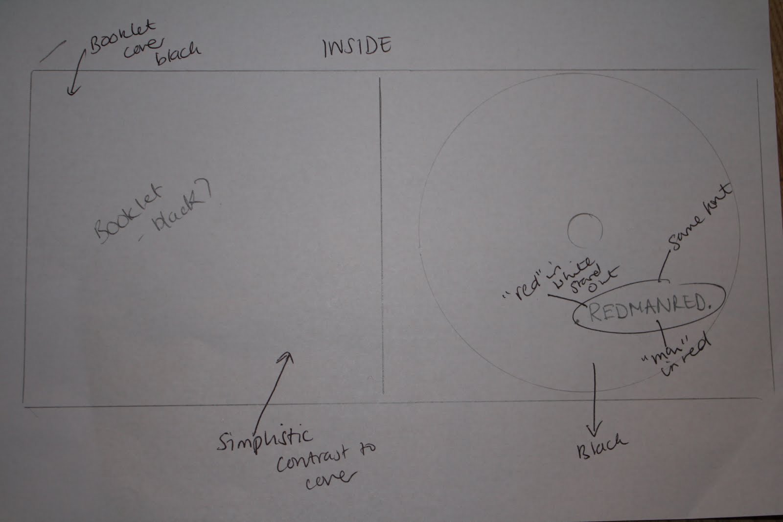
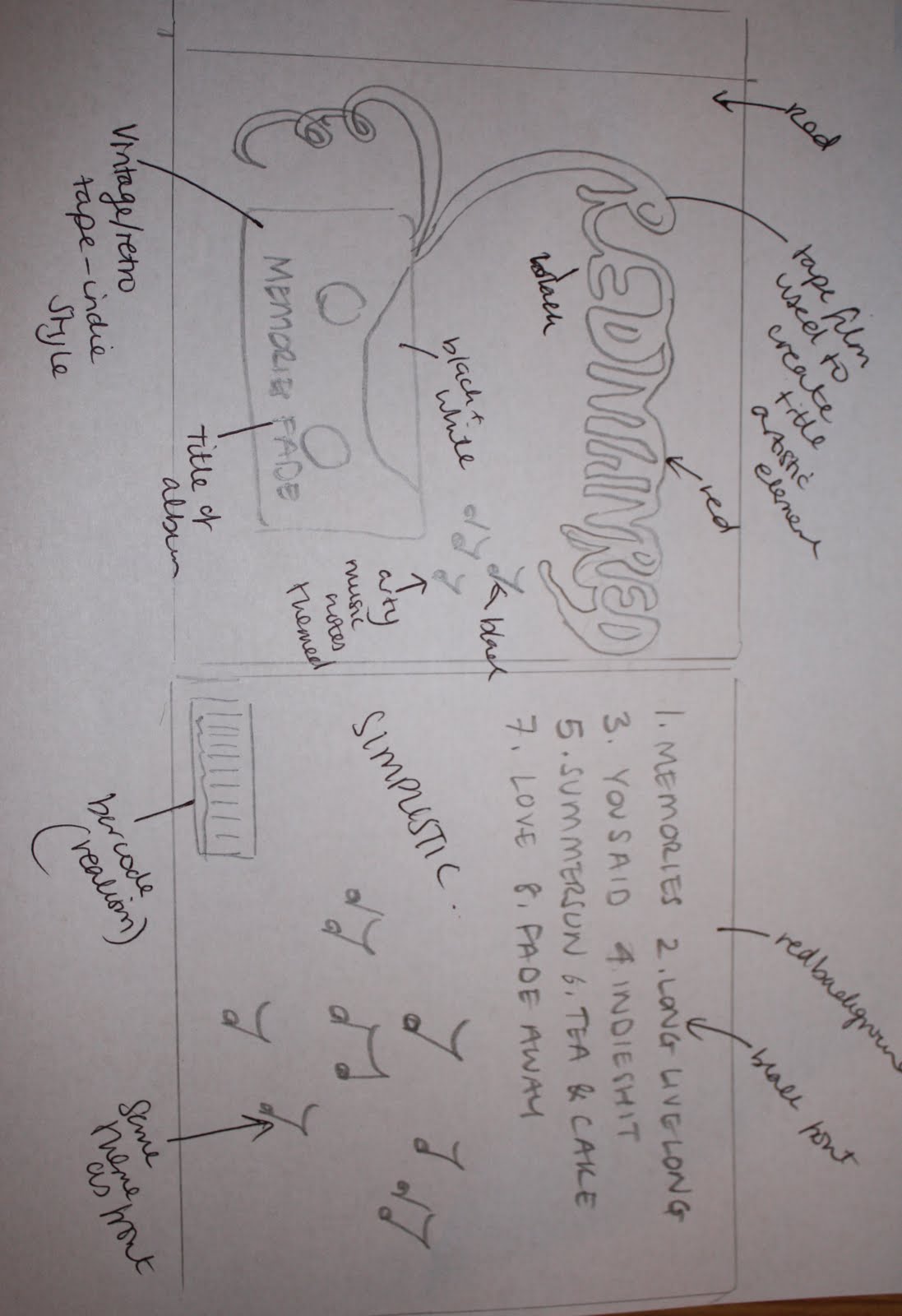
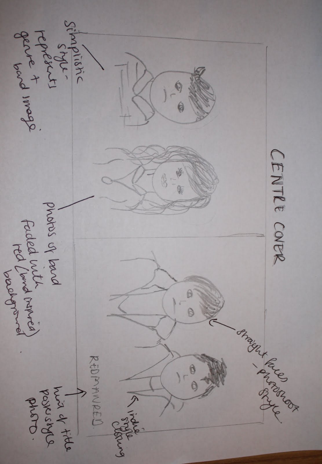
Final Chosen Digi Pack

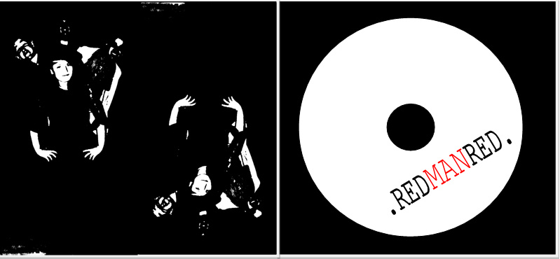
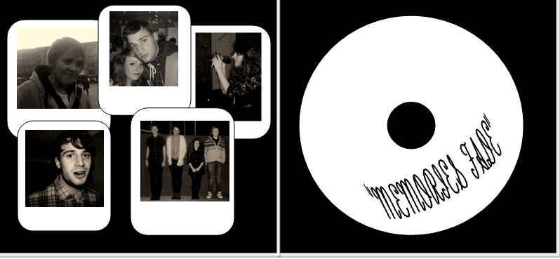
 After receiving a lot of feedback and collecting my results together I have chose OPTION A for my digipak, as I think it has a clear band image with the use of the 3 colours- black white and red.
Shows band persona and image - with photo on the front.
The font is kept the same throughout which keeps continuity in the theme of the package.
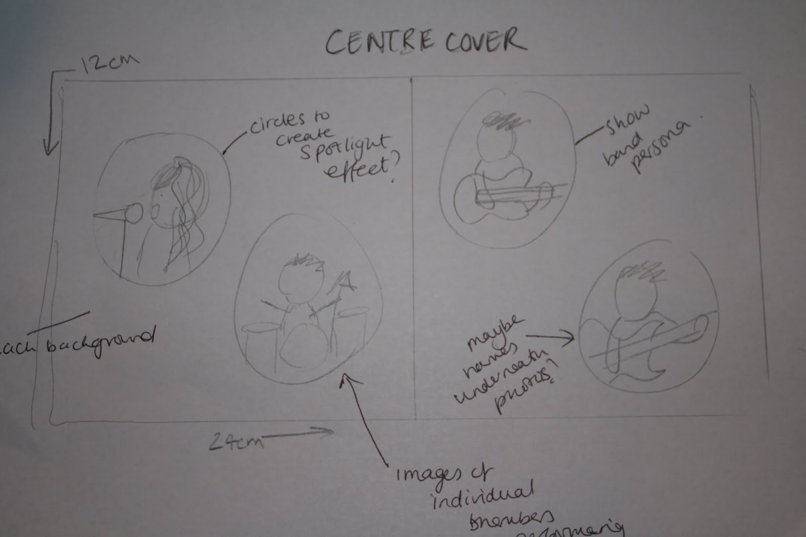
The Insert shows each band member and their name - a personal touch- also shows what instruments they play in the band. Also- could perhaps be a good poster?
The inside of the case is simple but effective - again same colours/fonts used.
Saturday 2 April 2011
Analysis of chosen Digipak and comparison of existing products
For my final chosen digipak I decided to analyse key features of my pack that made it successful, alongside which I compared this to an existing product on the market- of a Blondie cover from LP which is a similiar theme.
Visually, both packs have a band image with a black and white theme throughout, both REDMANRED and Blondie have a band title with a specific font. They both have prominent images of the band and their style with the main focus of the lead singer- Debbie for Blondie and Tamara for REDMANRED. Also I have noticed they both have the colour theme of black, white and red, and the red in both titles stands out to the consumer- this would be eyecatching on a shelf in a store like HMV. Both follow the STAR theory with brand image and style.
Friday 1 April 2011
Feedback for digi pack
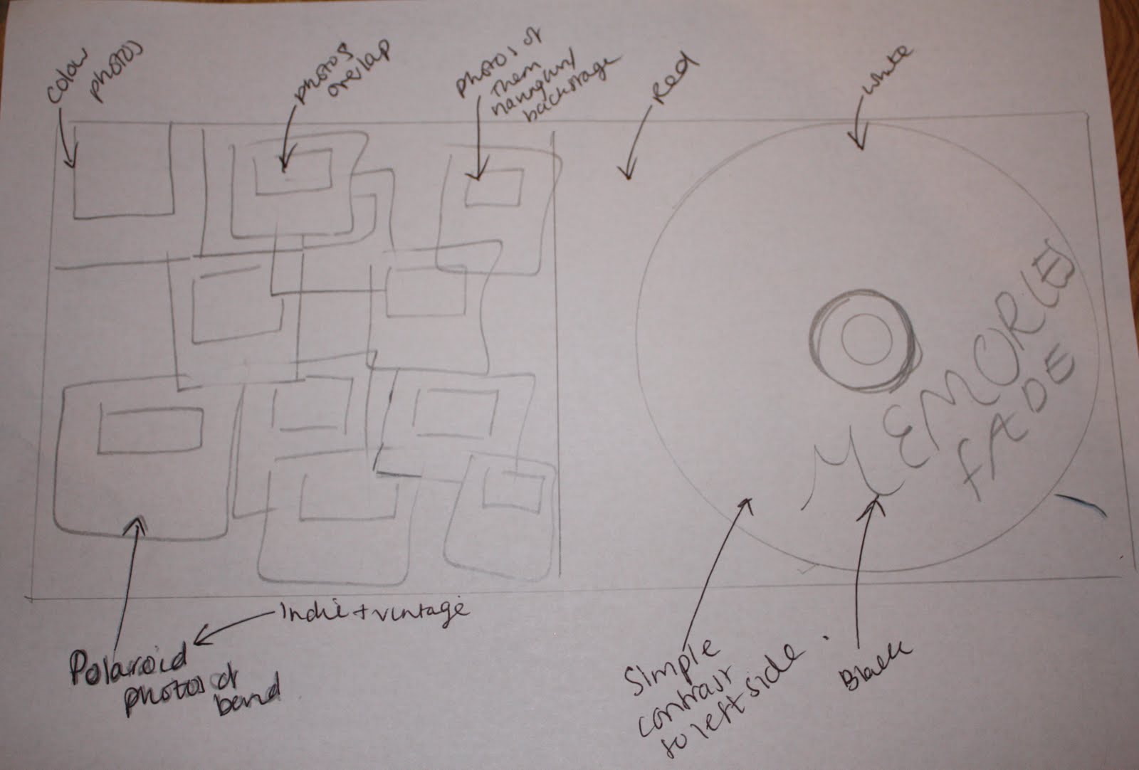
I presented 4 options of Digipak designs to a variety of people to find out which was the most popular design. Here are the 4 options:
OPTION A

OPTION B
 OPTION C
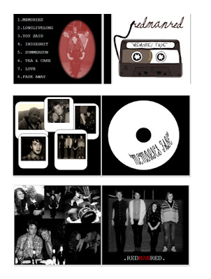 OPTION D
Here is a piechart of my results of the most popular:
 Comments Received:
"I really liked option A it had a clear theme and band image!"
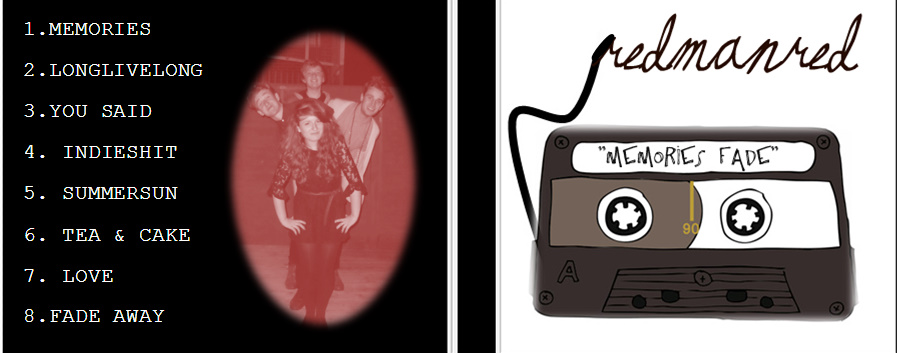
"The use of the cassette tape gave option 3 an indie style to the band-loved the idea of the title- yet the font is quite unclear"
"Option A looks professional, i like the use of the monochrome effect- black and white with the one word in red- really stands out!"
"The use of polaroid is good- but a bit too "computerised"- would of been better if they were proper polaroids- but like the idea - links to the title of album and shows band persona"
Sunday 20 March 2011


Saturday 19 March 2011
Analysis of magazine advert designs


Here are my three chosen Advertisements for magazines I have completed a brief analysis on each to help me with choosing my final design.
Friday 18 March 2011
Advert for magazine

 Here a few ideas for my magazine advert. I used the same font on each of the designs as this is my chosen font for the band title.
The main colour theme is black, white and red, I think the combination works well as they are complimenting colours and would stand out in a magazine page.
From my research, looking at advertisements in NME magazine, the magazine advert also includes the website of the artist/band and the several ways in which the album can be listened to. Especially with the indie genre bands more and more people are buying LP's again, therefore for my band this was also advertised.
What's more the photos on the advertisement are there to represent the band in full, 2 out of the 3 include the album cover as i feel it is quite original and stands out, what's more it suits the indie genre and it could be, potentially, a well known image.
Saturday 12 March 2011


Friday 11 March 2011
Using Picasa
Picasa is a photo tool programme that has enabled me to create my designs for my digi pack. It enabled me to create different effect such as editing the photographs and using different font designs.,..


Thursday 10 February 2011


Sunday 6 February 2011
Analysis of NME magazine- album advertisements
NME (new musical express) magazine is a music based magazine that's target audience is teenagers and young adults that share a common interest in the indie rock genre of music. My chosen band REDMANRED would be typical to appear in a magazine like this.

For my research I photographed certain elements in the magazine that are typical of NME, such as album adverts, this will help me when planning and drawing out my designs for the magazine adverts :) Plus- photographed extra pages to show band image and representation! :)

So,... the front cover appears with a photograph of Liam Fray - the front man of the indie band The Courteeeners. Other Subheadings that are included in the magazine include festival news and news on other bands such as The Strokes, The Maccabees and Bombay Bicycle Club etc...all representing the indie rock genre -likewise to my chosen band REDMANRED.


Subscribe to:
Posts (Atom)