Sunday 3 April 2011

Final Chosen Digi Pack


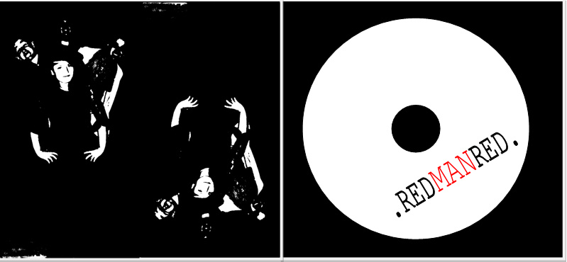
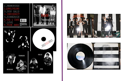
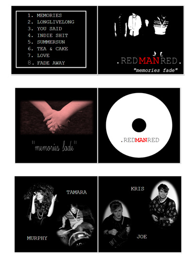
After receiving a lot of feedback and collecting my results together I have chose OPTION A for my digipak, as I think it has a clear band image with the use of the 3 colours- black white and red.
Shows band persona and image - with photo on the front.
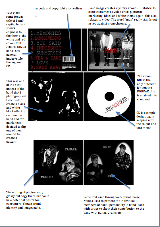
The font is kept the same throughout which keeps continuity in the theme of the package.
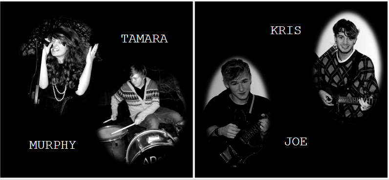
The Insert shows each band member and their name - a personal touch- also shows what instruments they play in the band. Also- could perhaps be a good poster?
The inside of the case is simple but effective - again same colours/fonts used.

Saturday 2 April 2011

Analysis of chosen Digipak and comparison of existing products


For my final chosen digipak I decided to analyse key features of my pack that made it successful, alongside which I compared this to an existing product on the market- of a Blondie cover from LP which is a similiar theme.


Visually, both packs have a band image with a black and white theme throughout, both REDMANRED and Blondie have a band title with a specific font. They both have prominent images of the band and their style with the main focus of the lead singer- Debbie for Blondie and Tamara for REDMANRED. Also I have noticed they both have the colour theme of black, white and red, and the red in both titles stands out to the consumer- this would be eyecatching on a shelf in a store like HMV. Both follow the STAR theory with brand image and style.

Friday 1 April 2011

Feedback for digi pack

I presented 4 options of Digipak designs to a variety of people to find out which was the most popular design. Here are the 4 options:


OPTION A


OPTION B


OPTION C

OPTION D


Here is a piechart of my results of the most popular:


Comments Received:


"I really liked option A it had a clear theme and band image!"


"The use of the cassette tape gave option 3 an indie style to the band-loved the idea of the title- yet the font is quite unclear"


"Option A looks professional, i like the use of the monochrome effect- black and white with the one word in red- really stands out!"


"The use of polaroid is good- but a bit too "computerised"- would of been better if they were proper polaroids- but like the idea - links to the title of album and shows band persona"